Visual Command Center
Visualization and situational awareness for managing critical events

How Visual Command Center works
Leveraging a single, unified, and integrated view for managing and responding to enterprise risk, Visual Command Center enables enterprises to gain situational awareness and risk resilience on an unprecedented scale. Through real-time threat intelligence, situational awareness, and integrated response and collaboration across the enterprise, security and risk professionals can better mitigate or eliminate the impact of critical events to their organization. These critical events can span across multiple use cases such as Life Safety & Security, Business Continuity, and Supply Chain Management.
Visual Command Center serves as the visualization and orchestration engine for the Everbridge Critical Event Management Platform streamlining the steps of Assess, Locate, Act, and Analyze, thereby enabling organizations to better manage operational risk.
Benefits
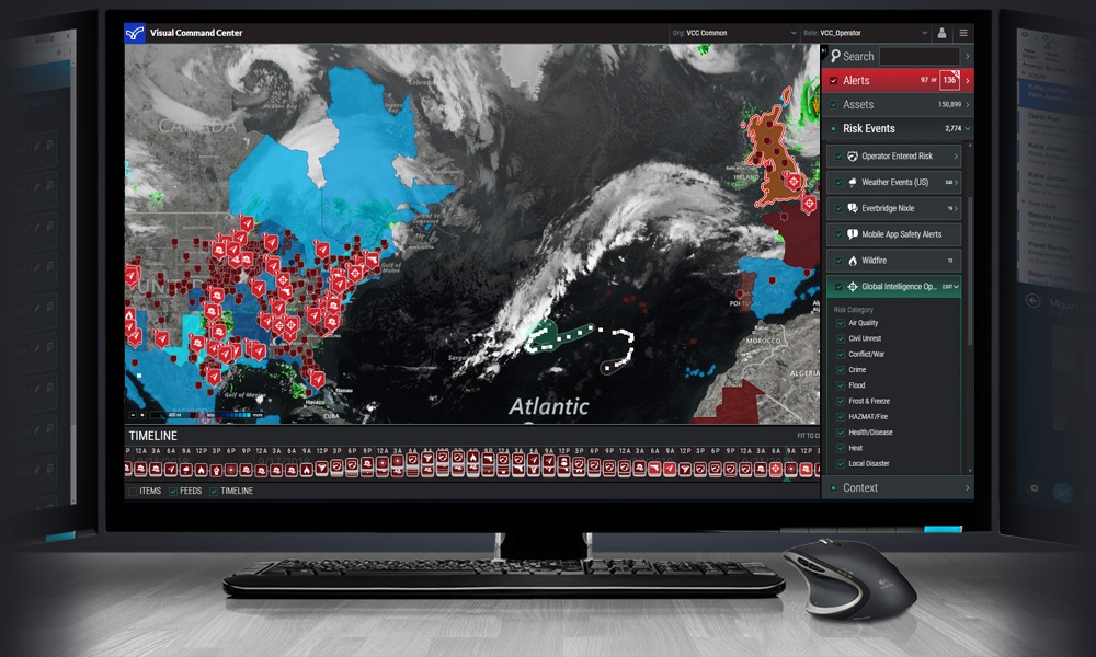
Gain a common operating picture
Visual Command Center allows you to integrate asset and risk data into a common operating picture so that you can quickly identify critical events that may threaten life safety or cause business disruptions.
Achieve situational awareness
Gain a complete and shared boots-on-the-ground understanding of critical events your organization faces so that operations can effectively manage day-to-day challenges and respond to disasters when they arise.
Drive a coordinated response
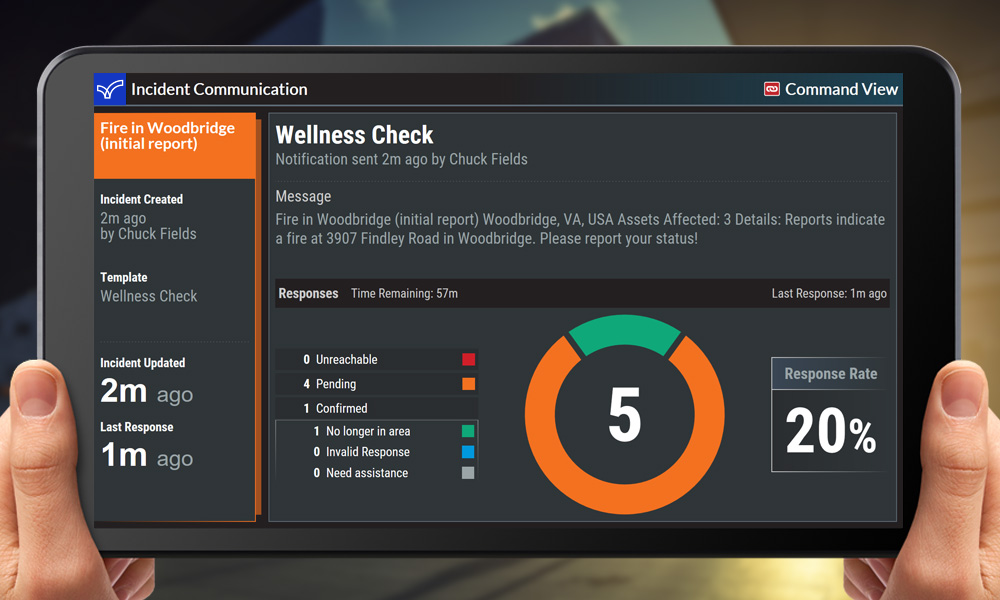
As the situation changes, Visual Command Center allows you to collaborate and communicate with key stakeholders through integration with incident communications and mass notification.

Avoid costs
Through better risk preparedness, organizations can be more proactive when dealing with threats. This can help them mitigate or avoid the impact altogether. This can result in avoidance of costs that might include shutdowns, fines, loss or damaged inventory and even loss of life.

Grow revenues
By improving risk resilience, organizations can take on more risk which might allow them to operate in new markets or take market-share from competitors that are less prepared for managing operational risk.
How Visual Command Center works
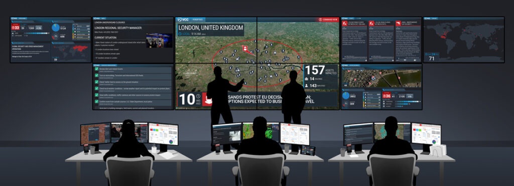
Operator console
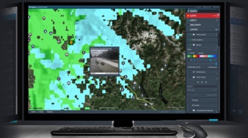
Visual Command Center brings together data about your organizational assets (employees, travelers, buildings, supply chain, etc.) and risk events (crime, terrorism, natural disasters, weather, health risks, activism, etc.) which it gets from public, proprietary and partner data sources into a highly visual common operating view. Visual Command Center then correlates those risk events to your assets through its Intelligent Alerting™ to identify critical events that could threaten your organization. Then using built-in assessment data and tools, you can quickly assess threats to determine the appropriate action to take and execute this action directly from the platform, thereby saving valuable time in execution. This time saved can help mitigate or even eliminate the impact of that critical event.
Integrated asset, threat and contextual data from multiple sources
Visual Command Center includes risk intelligence data from over 100 different sources to provide a comprehensive view of risk. Some of these types include
- Asset data from corporate Asset Management or HR Systems
- Integration with Safety Connection providing travel data and access control and badging information to understand an employee’s dynamic location during a critical event
- Weather and natural disaster data from sources including the National Weather Service, GDACS, USGS and more
- Threat data from our 24×7 Global Intelligence Operations Center (GIOC)
- Law enforcement and crime data from the Everbridge Nixle Network
- Risk event data from trusted partners like International SOS, Dataminr, NC4, and Anvil
- Traffic and traffic camera data
- Weather radar and forecast data from The Weather Company
- Ability to add KML/KMZ layers on-the-fly from trusted sources
- Operator-entered risk event
Channels
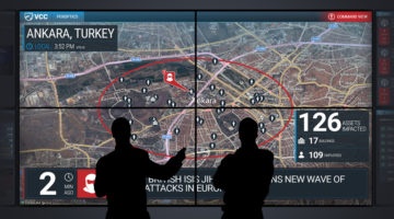
Visual Command Center Channels are designed to deliver the right information to the right people during a critical event or when your organization needs to understand the current risk environment. Channels can be broadcast on your command center video wall or on a mobile device or computer screen for stakeholders that are not in the command center or for organizations that have more of a “virtual” command center. Channels are organized into the following categories:
- Aerial Map Channel
- Alerts Channel (Summary and Detail)
- Assets Channel
- Grid Map Channel
- Incident Communications Channel
- Montage Channel
- Peroptics Channel
- Status Board Channel
Customer testimonials and case studies

National Oilwell Varco
“Visual Command Center empowers the GSOC to provide a credible voice from security to our overall business development plan. Our team and its overall understanding of our operational environment are essential to ensuring the continuity of operations, the safety of employees and security of assets.”
– Bob Bernazal, Assistant Director of Security, National Oilwell Varco

Microsoft
“Visual Command Center is essential to maintaining our security mission, from routine day-to-day local operations to crisis management at our facilities worldwide, making a real impact on our ability to keep our people safe.”
– Mike Howard, Chief Security Officer, Microsoft Global Security
Related resources

White Paper: 8 principles of supply chain risk
Read this paper to learn eight principles to help guide companies as they mature their supply chain risk management program and make changes to proactively respond to and minimize the impact of risk events. And explore three aspects of managing risk: identification, assessment, and mitigation.
White Paper: Improve performance with GSOC crisis management training drills
This paper peels back the training drill design process to create the best drill experience possible. You’ll learn what makes a great drill; how to decide who should be participating in the drill and who should be designing it; communication and messaging best practices.